
Dish Network
Live Streaming Interface Design for DISH
My Role
Product Designer
Team
Product Owners, Developers, Design Lead, UX Writer
Duration
2 Weeks,
March 2023 - April 2023
4 min read
Industry
Hospitality
Overview
The brief was to redesign the live player, for the platform, I led the end- to- end design direction of the player experience and also presented the design to cross functional teams
2+
Cognitive Walkthroughs
Ran cognitive walkthroughs with devs and internal teams to spot usability gaps and align on flows.
3
Concept Presentations
Presented concepts to teams across Roku, Hulu, and others to gather feedback and align on direction.
1
Major Critique Sessions
Presentations and Feedback with parallel design teams & Product owners.
1
Recognition Award
The design was shortlisted for the 2023 HTNG Techovation Award, with the Onstream platform named a semifinalist.


The Context
What is Onstream?
Onstream is a platform-as-a-service that powers digital experiences for hotel management, staff and guests.
Streaming and casting capabilities provide a modern guest entertainment experience while flexible system integrations help hoteliers personalize offers & increase efficiency.
The Problem
Through research and sales insights, the product team identified shortcomings in the current player, outlined user stories, and derived requirements, culminating in a clear problem statement
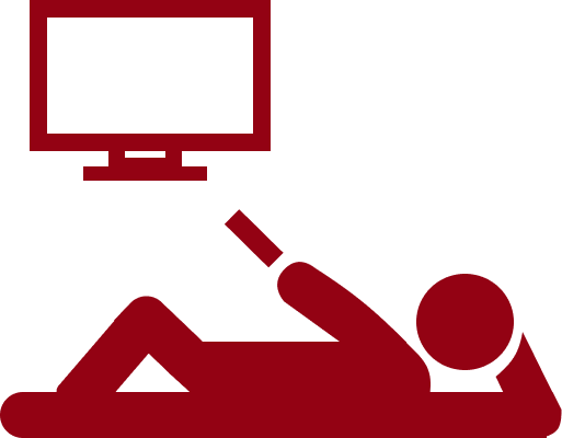
The existing live player lacks essential user functionalities for user control and customization including playback, navigation, recording and caption management.
The Solution
Innovation without losing Identity.
Identified opportunities to add new features by building on the existing player’s visual identity while addressing core issues through targeted strategic enhancements rather than a full redesign.
Mini guide in the form of widget rail

How does this change help users?
Recording starts with a single click.

How does this change help users?

The version 3.1 which included this design was shortlisted for the 2023 HTNG Techovation Award, with the Onstream platform named a semifinalist.
Impact
Adding value to the business
The new live player designs were introduced in Onstream version 3.1. Following phase one of user testing, the majority of participants found it easy to navigate channels and record them for later viewing.

Here's how my design process delivered on what the Dish team envisioned

Task 1
Switch channels using the mini guide.
Task 2
-
Clicks - 2 ( Pause + right click)
-
Time - 10 seconds
View Captions
Task 3
-
Clicks - 3 ( Pause + right click + right click )
-
Time - 40 seconds
-
Clicks - 3 ( Pause + left click + left click)
-
Or back button on remote
-
Time - 18 seconds
Exit live player
User Research
With tight timelines, no research team, and pressure from devs for quick results, I prioritized fast, high-impact research methods to drive informed decisions.
But first, I stepped into the user's shoes.
"As a live TV viewer, I want to control playback, record shows, adjust volume, manage captions, and exit the player easily"
After independently analyzing the platform, I adopted a three-phase approach.


Noticing the gaps
Iterative Observation
I tested three core tasks on the current live player to evaluate its usability. Through hands-on use, I identified key interaction pain points and potential constraints based on direct observation.
I led a task analysis with developers and QA engineers to evaluate key user flows in a real-use setting. This helped uncover usability issues, validate interactions, and align on any technical limitations early on.
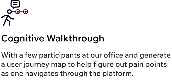
More Perspectives, Richer Insights
Cognitive Walkthrough
8/10
Had problem accessing channels via the mini guide
Developers
3/5
Testing Engineers
Found it hard to access channel info & navigate smoothly.
2/5
Testing Engineers
Mentioned the overall UI to be cluttered causing visual load
10/15
Participants
Found the exit icon redundant and unnecessary.
Journey Map
User Behavior, Step by Step
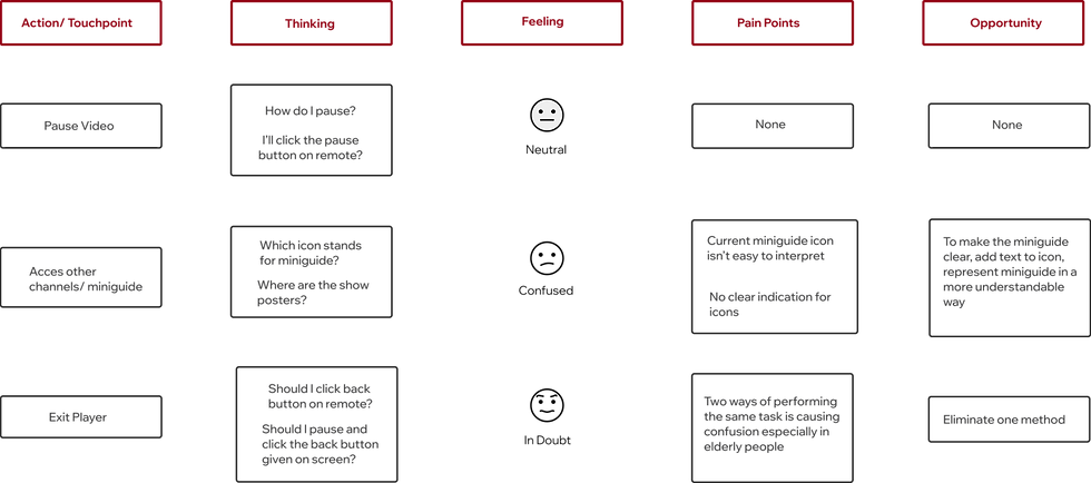
Based on our journey analysis and usability testing, we identified two core issues:
-
A confusing mini guide
-
A redundant back button
Turning Friction into Clarity
Results
Creative Alignment
Ideation
To initiate ideation, I aligned the live player’s existing challenges with the product team’s feature requirements to ensure focused and effective solutions.
Address current Issues
Final Solution
Include new requirements set by team
The learning curve
Understanding 10 foot design approach
With prior phone and desktop experience, designing for TV felt new. I prioritized learning basics like legibility, prioritizing user- friendly controls, adequate negative space and simplified input.
Iteration
Continuous Improvement
Early in the design process, I held multiple review sessions with the product team and developers to gather input, align on direction, and quickly iterate based on real feedback.

.png)
.png)
We liked the new miniguide design especially the genre filter feature
3 out of 9 individuals expressed concerns about the excessive number of widgets in the single rail.
Team Insights
Option 1: Changed mini guide to widget rail and added genre filters
Option 2: Since the remote has a back button, I removed the on-screen one for TV designs.
We are good with elimination of back button
4 out of 9 individuals suggested ensuring uniformity in the browser's back button design as well.
Team Insights
Option 3: Viewers can instantly record live shows with one click and watch them later anytime.
Happy with the easy record option and placement of the button
All 9 individuals indicated a lack of clarity regarding the recording duration for shows.
Team Insights
Based on the feedback, I refined the design through focused iterations to arrive at a solution that was both user-centered and performance-ready.
Final Design
Designs, Locked & Delivered
As this project constitutes a feature redesign of the existing live player, there haven't been any modifications related to the design system. As a result, all elements such as colors, typography, icons, and more, have been directly sourced from Dish's design system.

Record Button
Go Live
Closed Captions Button
-
Mini guide appears when video is paused
-
Channels are displayed with their respective posters
-
Channel filters help users navigate quickly


Meet the New Live Player
Impact
Adding value to the business
The new live player designs were introduced in Onstream version 3.1. Following phase one of user testing, the majority of participants found it easy to navigate channels and record them for later viewing.
The version 3.1 which included this design was shortlisted for the 2023 HTNG Techovation Award, with the Onstream platform named a semifinalist.
Learnings
Reflections & Takeaways


Curious to know more?
Shoot me an email @saloni13naik@gmail.com
Explore other case studies


A Spatial Motion Intelligence Platform
Culturally, I fit high-energy teams, If this sounds like you, I'd love to talk!
Designed & Developed by Saloni Naik.
c
2025
I'm around on social too :)
Less noise, more meaning.