
Salesforce
Re-Imagining Trailhead with Agentforce

My Role
UX Designer
Team
PM, Principal Product designer, UX designers & Researchers
Duration
40 Weeks,
Sept 2024 - May 2025
Industry
Ed-Tech
8 min read
Overview
Trailhead is a free e-learning platform by Salesforce to teach business, skills, tech and Salesforce tools to learners. I led a team of 3 Designers & Researchers to collaborate with the Salesforce team over the span of 9 months.
3+
Months of mixed methods research
Desk Research, Competitive Benchmarking, Contextual Inquiries, 20+ Interviews.
30+
Collaborative Sessions
Hypothesis Validation, Risks, Mentorship, Scope definition, Success Metrics & KPIs.
2+
Major Critique Sessions
Presentations and Feedback with upper management of Trailhead team.
Multiple
Rounds of User Testing
Over 3 rounds of user testing with peers, users and stakeholders.
The Problem
Navigating Layered Problem Spaces
The Trailhead team shared a How Might We prompt and asked us to develop a solution in response.
"How might we use Artificial Intelligence and/or Machine Learning to enhance the core learning experience on Trailhead?"
I started by identifying real issues in the current interface, then explored how AI could help solve them.
So, How did I approach this?
A Vague Starting Point
The Solution - Phase 1
A Re-Imagined Dashboard for EasyLearning


The Solution - Phase 2
Quick Course Search + Course Notes


Impact
How things got better?
We integrated Agentforce into search and added new features that genuinely helped users. Feedback was positive from both users and the Trailhead team.


Here's how my design process delivered on what the Salesforce team needed
The Beginning
Setting the right objectives.
Before starting research, I reviewed the goals document, aligned with the product manager on the two-year roadmap, assessed risks and budgets, and then set clear objectives for the design approach.


Defined Objectives

User Research
Trailhead Review Analysis

4+
Social Media Platforms Analyzed
Sentiment Analysis of user reviews helped us uncovered their candid thoughts.
Conversations with our users.
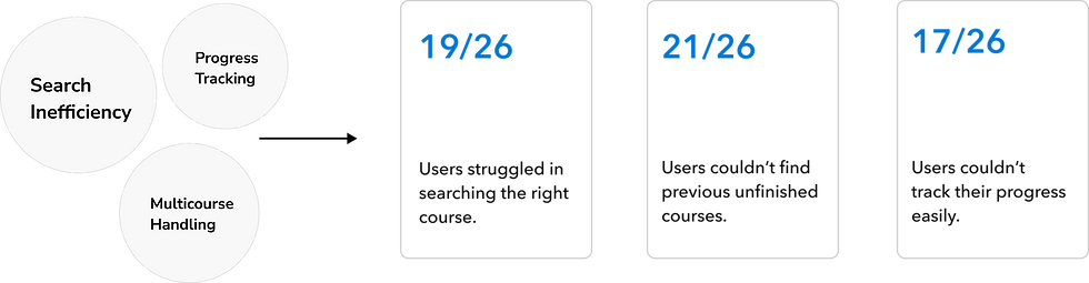
We conducted 26 interviews - 19 with salesforce employees and 7 with external users, to gather a wide range of insights for the project, out of which I conducted 6 interviews.
My Role
I crafted questions and analyzed insights to uncover patterns and address user pain points.
Tools


User interviews revealed critical usability issues and friction in the journey.
Uncovering Key Painpoints
I asked a few users to search for a course, complete a module, and start a new one. I tracked their journey to identify points of friction.

Journey mapping revealed key moments of friction in the user experience.
Research Hypothesis
Based on the insights and themes uncovered, we mapped them using affinity diagrams and followed up with a SWOT analysis to narrow down our focus areas.

Opportunity mapping helped us zero in on the areas with the highest impact and guided where to focus our efforts next.

3 chosen areas of improvement
Competitive Analysis
Competitor Benchmarking
After identifying key focus areas through user interviews, we conducted a competitive analysis to better understand market trends and positioning.

After completing competitor benchmarking and finalizing the focus areas, I identified potential limitations, and outlined a clear vision of success.


Ideation
From Lines to Layouts


6+ hrs
Group discussions
40+
Design Iterations


Search Functionality
#Pain-point 1

*Current "search" design of Trailhead*
How did I address it?
Based on competitive analysis and user feedback, I introduced AI-powered search prompts and smart result suggestions.
i
The Hidden Cost of "Search"
During ideation, the product manager flagged a key insight: a large chunk of our budget goes toward serving search results because we're relying on a third-party server.
How our solution effectively mitigates the problem?
Solution: Search Prompting
By guiding users through search prompting, we reduce time spent searching, minimize trial-and-error, and lower backend calls triggered by poorly structured queries.


Progress Tracking
#Pain-point 2

How did I address it?
Research revealed a gap not only in how progress was displayed but in how easily users could stay on top of it.
I designed a clear section for tracking and introduced a supporting feature to make the experience more intuitive and actionable.
Before
After

Solution: A dedicated section with course details, status and plan.

Provided a clear visual indicator of course progress
Added a study plan to help users organize their learning
Made unit information and upcoming content easy to scan and understand
New Feature: Study Plan
The study plan gives users a structured way to navigate complex courses. With multiple modules to complete, it helps users prioritize, stay organized, and receive timely reminders to stay on track.


User Testing
Validating the design.
Before finalizing the concepts and visual design, we conducted moderated user testing to collect direct feedback, observe user interactions, and identify opportunities for refinement.
Methods
Think Aloud, Time on Task, Moderated Study
Participants
10 Salesforce employees, 4 non employees.
Results
Users responded positively to the redesign and new features. They highlighted the improved search functionality and clear affordances as key enhancements. Overall, the feature additions were well received and embraced.
11/14
Users were able to find courses 60% faster compared to before.
10/14
Believed study plan was a fantastic addition to the platform
Visual Design
Refining the Design Language
I primarily leveraged the Trailhead Design System to maintain visual consistency, while also designing a few custom components to support new functionality and enhance clarity within the updated layout.


New Additions
Based on the existing components, I identified a few strategic gaps and proposed additions to the design system that better support the newly introduced features. The goal was to maintain consistency while extending flexibility where the new functionality demanded it.


Modal for Study Plan


Color codes for course content


Interactive Prototypes
Designs, Locked & Delivered
Post finalizing the visual approach, the designs were handed off for internal testing to evaluate usability, interaction clarity, and alignment with product goals. Following validation, they were prepped for development handoff.
1. Quick Search + Course Notes
User and Business Impact
Improved content visibility and clarity to support user satisfaction and retention. Smart suggestions reduced decision time, driving faster discovery and stronger engagement.

2. Re-Imagined Dashboard + Study Plan
Study plans and progress tracking keep users organized, engaged, and on track—boosting course completion rates and encouraging consistent learning, which supports higher LTV.
User and Business Impact

Impact
How things got better?
We integrated Agentforce into search and added new features that genuinely helped users. Feedback was positive from both users and the Trailhead team.
Next Steps
What I Would’ve Done Next.
After handing off and supporting implementation, my next focus would have been designing a way to connect employee calendars to the study plan. This would make time commitments visible to managers and help them factor it into performance reviews and promotion cycles. Since most employees take these courses to upskill, surfacing that effort in a structured way adds both accountability and recognition.
Proposed Design
Future Scope


?
What were the trade-offs that kept this out of the current scope?
The calendar integration falls under a separate team, and given our current bandwidth, access limitations, and timeline, it wasn’t feasible to include in this release. That said, the Trailhead team responded positively to the concept, and it’s now being considered for future iterations.
Learnings
Evolving my Design Lens.


Sharing the Vision.
I presented the design at the IU Capstone ’25 event, where it was well received and earned strong recognition.


Culturally, I fit high-energy teams, If this sounds like you, I'd love to talk!
Designed & Developed by Saloni Naik.
c
2025
I'm around on social too :)
Less noise, more meaning.